 Before | 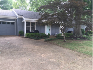 After |
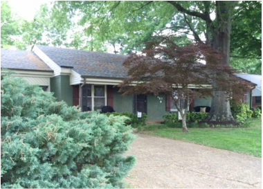
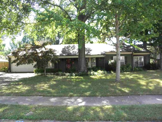
This was a fun project. My clients are a wonderful easy going couple who downsized to this cute house. The house was disappearing with this shade of green, and my clients were often told how small their house looked from the outside but how big it felt once you got inside. So, I was able to apply a couple tricks to increase their house's appearance.
I love how light and airy this house turned out even though we used a medium dark shade.
Its difficult to see from this picture but the roof is very new and still has bright green, blue and red tones. I am guessing that somehow this was a planned color scheme as the roof and the house had similar colors. My clients were very distraught with the color of the roof. My first suggestion was to pull from the roof the color they liked.
My approach to increasing the general curb appeal and pleasing my clients was to choose a color for the facade that would draw colors from the roof that we liked, namely the charcoal. Our goal was a Nantucket cottage with a suburban destination (ha that sounds so silly but I am serious). Therefore, we needed to find the perfectly balanced grey with enough green and just the right amount of blue undertones. After several other options we chose Sherwin Williams Software.
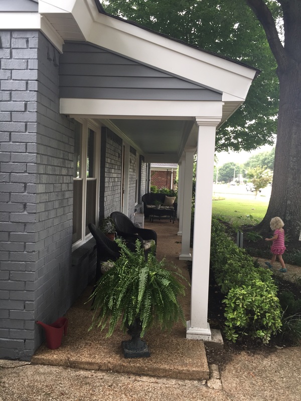
The pop of color and shutters are also Sherwin Williams. The door and porch ceiling are SW Tidewater, while the shutters are Urbane Bronze. We utilized the Urbane Bronze in the back of the house on the door to pull the accents together.
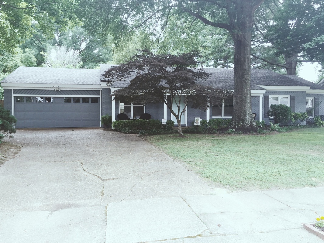
Note: When I noticed they had this gorgeous maple tree, I had to get them to agree to Urbane Bronze! It echoes the deep notes in the maple tree perfectly.
By using a continuous even trim along the windows, garage and front door we accomplished a long lean cottage feel. We increased the open feeling on the porch by minimizing bulky shutters, trimming the door and adding columns with the same color as the rest of the house trim (Snowbound by Sherwin Williams), and adding a pop of color.
The pop of color and shutters are also Sherwin Williams. The door and porch ceiling are SW Tidewater, while the shutters are Urbane Bronze. We utilized the Urbane Bronze in the back of the house on the door to pull the accents together.
Note: When I noticed they had this gorgeous maple tree, I had to get them to agree to Urbane Bronze! It echoes the deep notes in the maple tree perfectly.
By using a continuous even trim along the windows, garage and front door we accomplished a long lean cottage feel. We increased the open feeling on the porch by minimizing bulky shutters, trimming the door and adding columns with the same color as the rest of the house trim (Snowbound by Sherwin Williams), and adding a pop of color.
This two toned approach didn't work for this house design. It made the roof appear to sit heavy on the main structure, especially, in the case for the front porch. It was literally weighing heavy on this front porch, even though the trim was light in color. I wanted to maximize their porch space and lengthen their home.
By using a continuous balancing toned white trim along the windows, garage and front door we accomplished a long lean cottage feel. We increased the open feeling on the porch by minimizing bulky shutters, trimming the door and adding columns with the same color as the rest of the house trim (Snowbound by Sherwin Williams), and adding a pop of color on the door and porch ceiling.
Here you see we broke up the trim which is continued around the house allowing for the main structure to seemingly rise up to meet a roof of similar color for an unimpeded appearance.
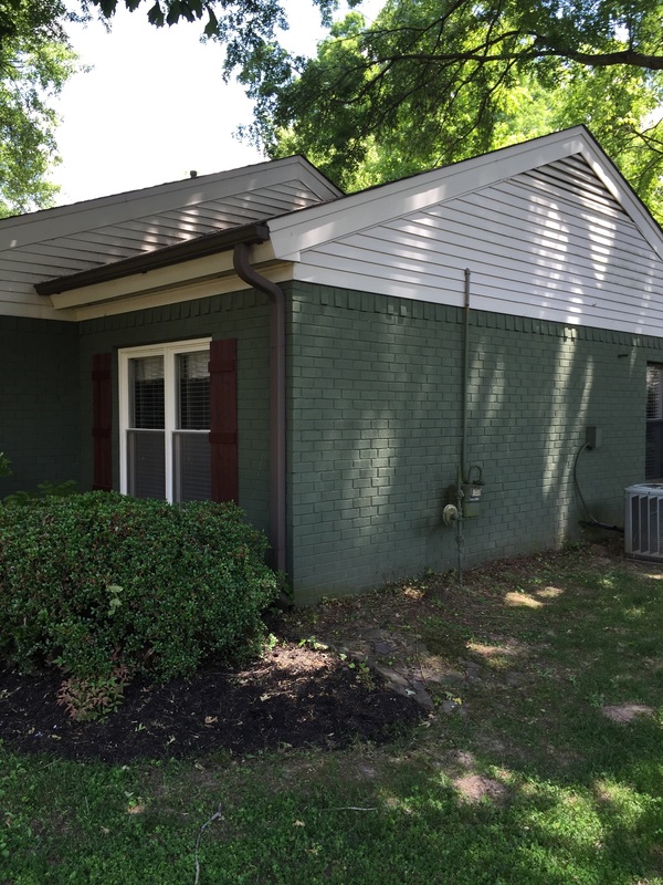
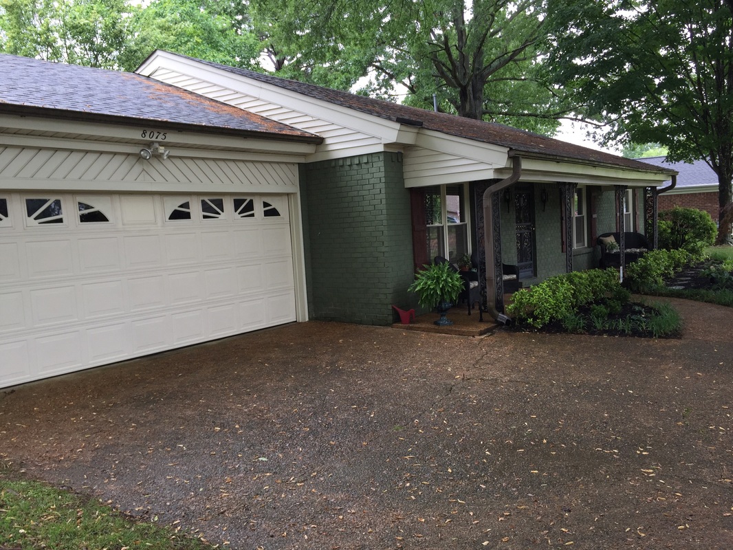
In this photo you can see the side of the house before we changed the siding color.
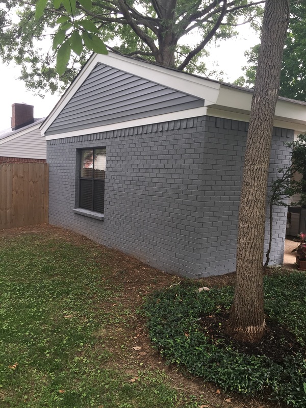
Compared to the two toned color scheme this one seems to heighten and accent this little "Nantucket cottage" perfectly!
good bye dark and gloomy with weird neon roof….

 RSS Feed
